Salesforce
A Fun Game App for Dreamforce & Elegant UIs
Salesforce is one of the world’s most innovative companies, and a leader in cloud-based CRM that revolutionized SaaS (Software as a Service). Over 150,000 companies user their product today, so I was thrilled to get asked to be the design lead for several high profile projects. Salesforce understands that "a brand is a promise." It’s not just about their product, but a culture of promoting customer success and connecting customers with their information. Plus, they have a vast library of beautiful brand assets to work with—assets with a lot of personality.
As Marc Benioff, chairman and CEO of Salesforce.com, wrote in his book Behind the Cloud, they created a powerful branded personality by "consistently delivering an attitude that is future focused and pioneering."
It’s with this ethos in mind that I approached each one of the projects. Let’s have a look:
Project Type: Product Design for Dreamforce
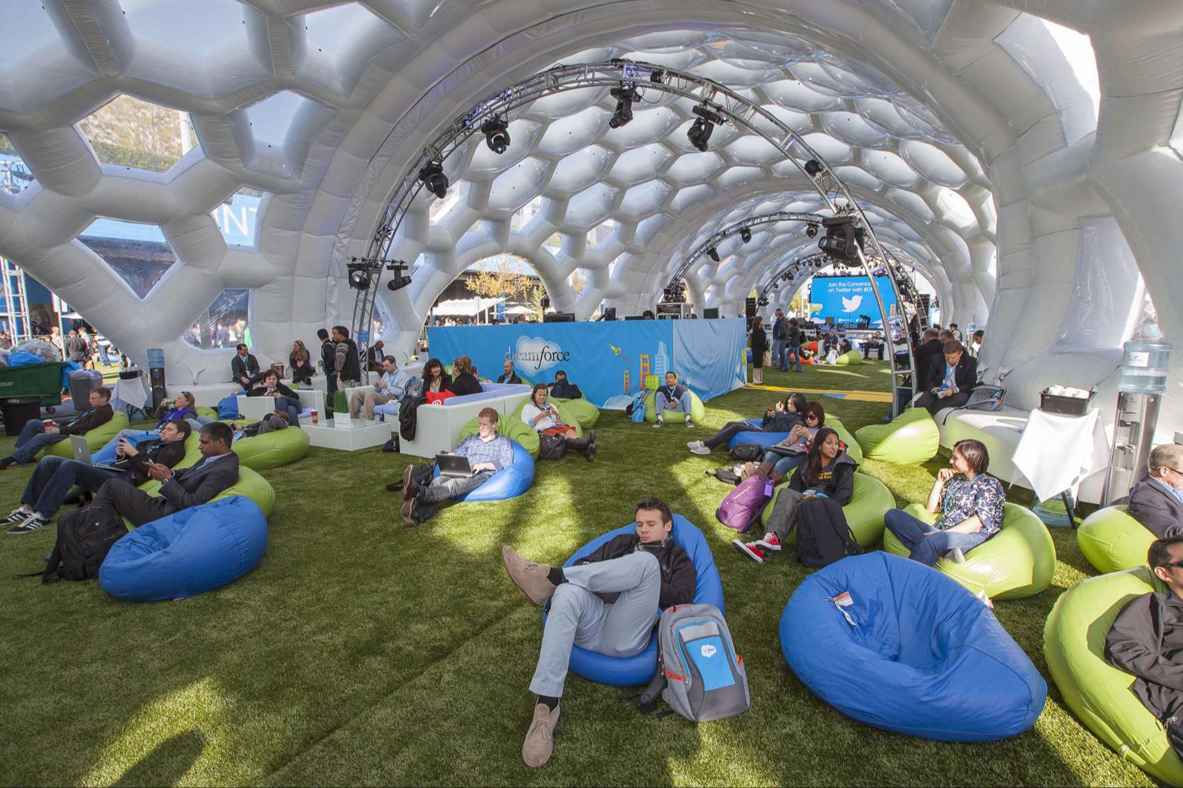
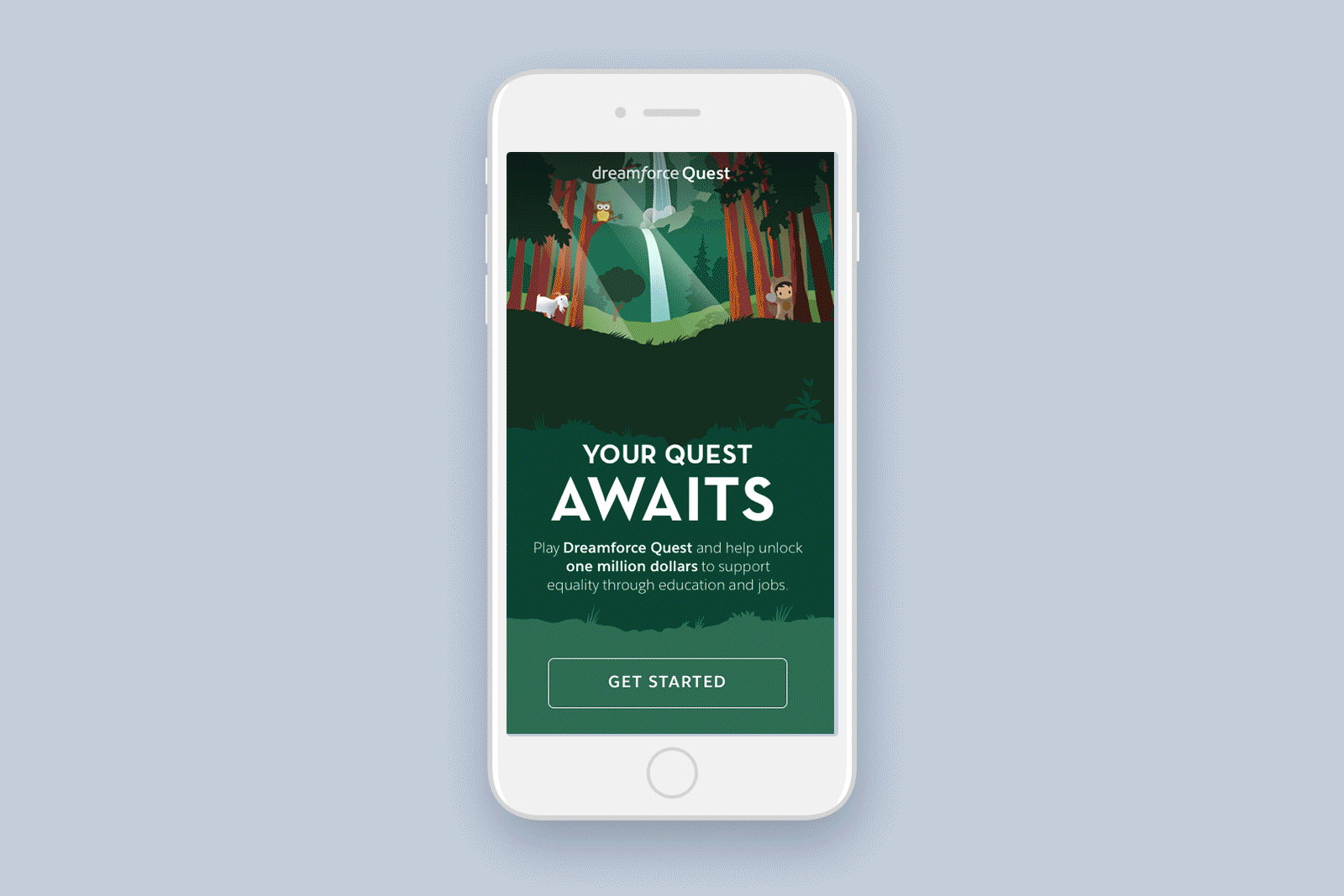
Dreamforce is Salesforce’s annual user conference, where over 175,000 attendees descend upon San Francisco to learn and connect with industry pioneers, thought leaders, and IT professionals. So when I was tasked to come up with an concept for their conference game app, I was over the moon!
The Quest game objective is simple: download the Salesforce Event app to initiate, then scan your mobile phone at five specific points to move along your curated Quest path. Each path is tailored to the user’s Salesforce role, such as Admin, Sales, Service, Marketing, Commerce, or IT. Once completed, attendees unlock a $50 donation that goes toward equality though education and jobs. In addition, participants can pick up a prize at the end. Personally, I'd be pretty chuffed to win a pair of limited-edition socks with Codey the bear on them.
My role as the Product Design Lead was to come up with a user flow, a functional prototype, and the overall UI look and feel that aligns with the Salesforce brand. Final screens were handed off to an animator to create small moments of delight at certain key points, such as unlocking a stop or completing a quest.
In addition, I collaborated with the amazingly talented illustrator Tony Bui of TonyBuiFanclub.com to illustrate the interactive maps Dreamforce attendees would use to navigate the campus-wide experience. Was it a success? Hell yeah! See what Salesforce has to say about the Quest app.
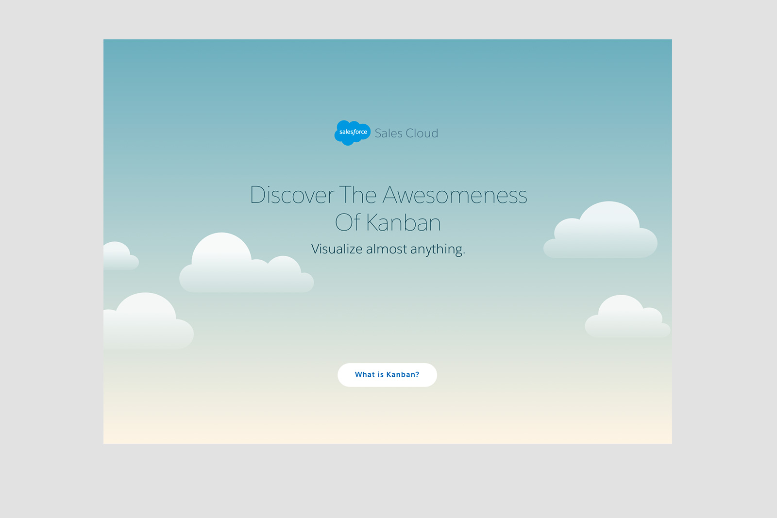
Project Type: Microsite
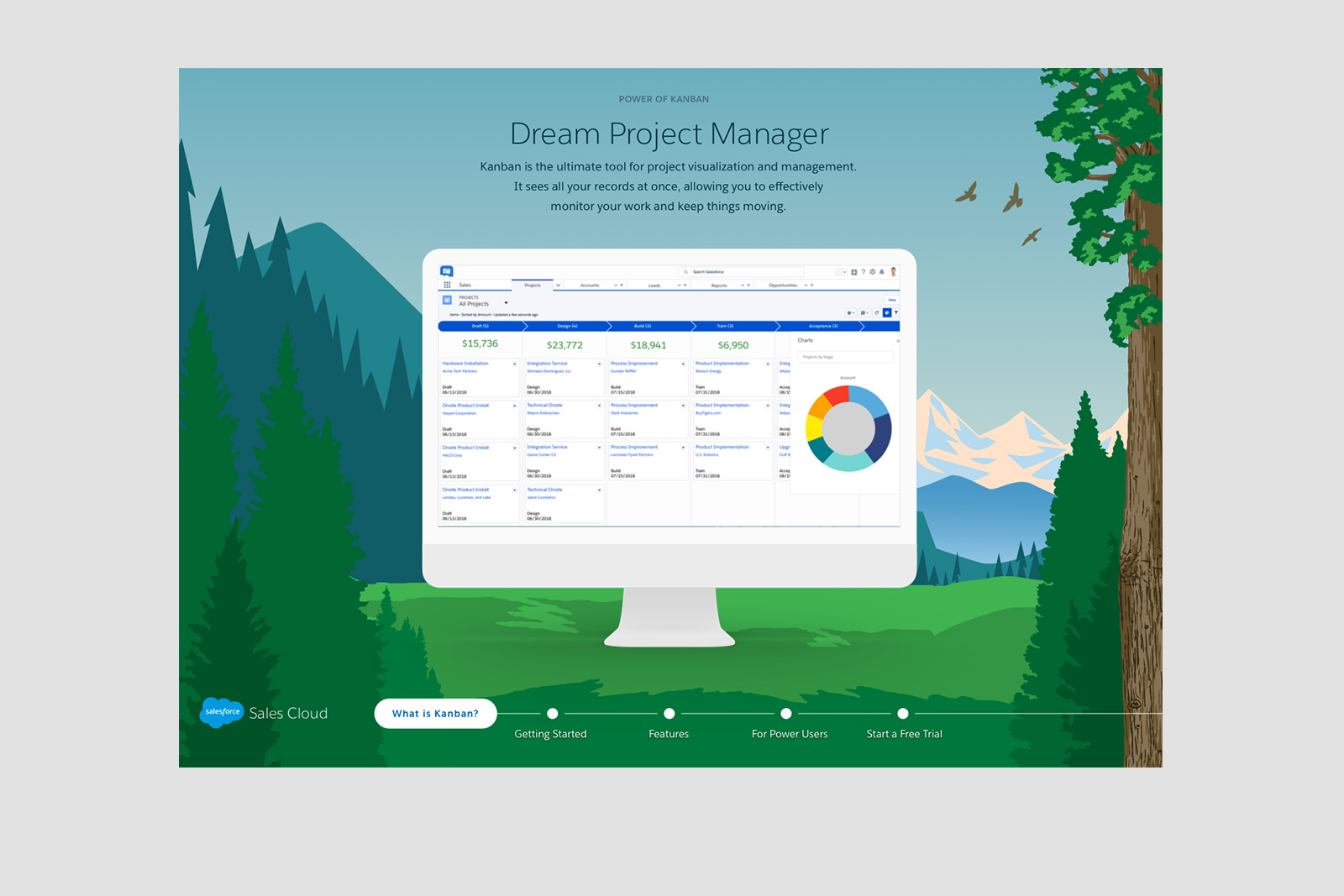
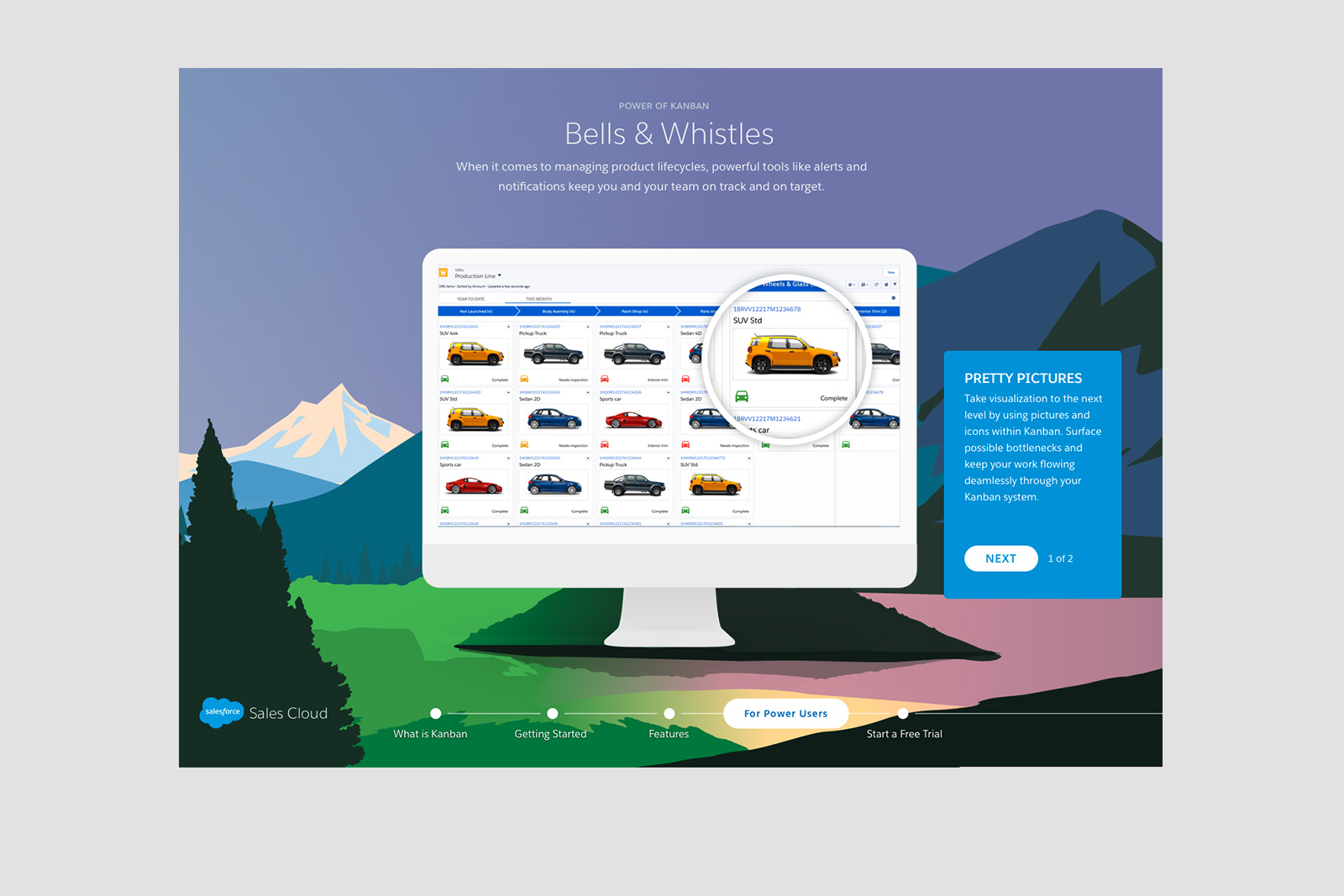
In addition to an awesome game app for Dreamforce, the Sales Cloud team at Salesforce wanted to showcase a new Kanban view of their Lightning platform during the 2017 conference.
Kanban is a visual system of managing workflows and processes. The goal of kanban is to identify potential bottlenecks in your business process and fix them so workflows stay lean and efficient. Kanban, which means signboard in Japanese, is essentially a card sorting system. If you’ve ever used Trello, you’ve used kanban.
The goal of this project was to design a standout microsite to promote and demonstrate the features of kanban. The technical requirements were, in order of importance, (1) it needs to display well on iPads in landscape mode, since Sales Cloud team members would be walking around the conference floor with devices in their hands to show people how the product works. And (2) make it look good on a desktop, too.
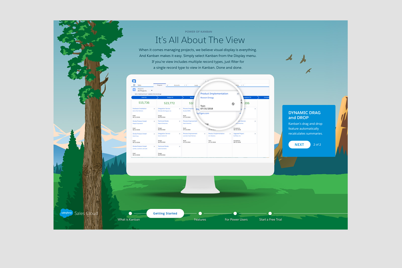
With that in mind, how do I make this both functional and comfortable for a user who’s holding an iPad for hours at a time?
The problem I saw was the short vertical scroll space when a tablet is held in landscape mode. With 4 use cases to present, that’s a whole lot of short swipes to reach the information, and I foresaw a lot of hand fatigue as a result. So I did the unthinkable, and changed the scroll pattern to a horizontal scroll but incorporated a nice parallax effect that subtly changed the background as the user moved through the experience.
Even with the wide adoption of mobile devices, where touch gestures are used to swipe for content, users have not fully embraced horizontal scrolling. So this pattern was a tough pitch, but the client understood the rationale behind it and greenlit the idea.
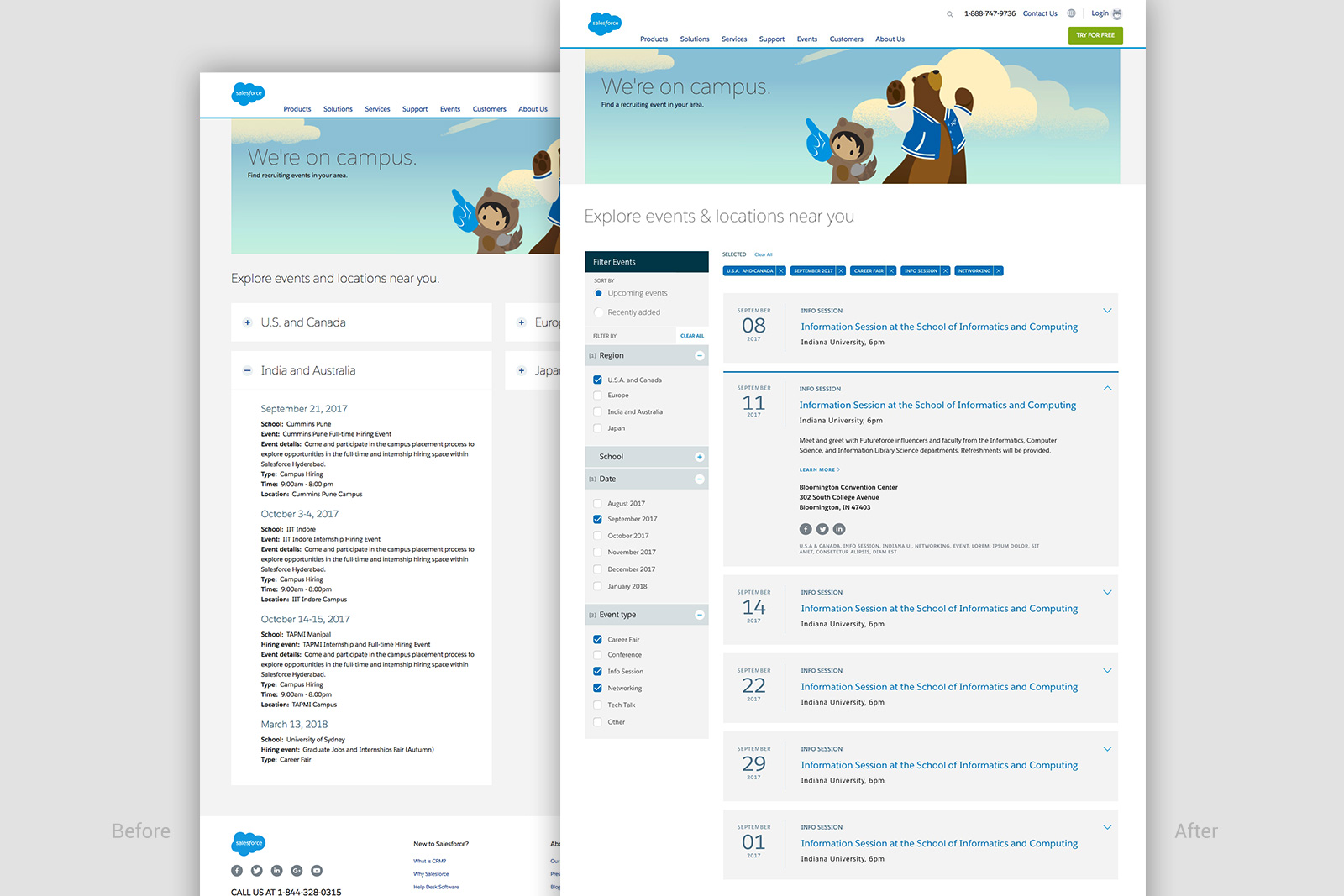
Project Type: Calendar UI
Sometimes the least "sexy" of projects can be the most satisfying. But I love a good visual problem to solve, and in this case, the problem was taking a jumble of information from a very rudimentary list of information—one that offered a poor user experience—and turn it into a sortable, functional, and easy-to-read calendar of events.
Information can be a elegant thing when you treat each quantum of data as a design element in its own right.
Check out the before and after screenshots below, and you’ll see what I mean.