Earthjustice
A leading environmental nonprofit organization gets a design makeover
Project Type: Email Marketing & UI Design
One of the best parts of the work I do is seeing the transformation that takes place when I redesign a client’s website or other communication piece. It’s really quite satisfying to take an under-designed digital experience and give it the right amount of spit and polish.
That was the case with Earthjustice, one of the leading nonprofit legal defense organizations that protects the environment. When Congress decided to undermine the Endangered Species Act, for example, Earthjustice was right there pushing back on the legislation that would threaten our air, water, land, and wildlife.
An outside firm has redesigned their site about 4 years ago, and most of it had been updated and maintained by a staff of talented people, but not a UI or UX designer in the bunch. So all the little details that make a site well-organized, professional, and polished were overlooked because they were always running in maintenance mode. And to be honest, the current administration has been keeping Earthjustice pretty busy lately, so there was a lot of recent casework to feature, news stories to update, press releases, and so on.
Now it was time to take a hard look at the holistic experience, from the information architecture to microcopy to the way the H tags were inconsistently styled.
So in doing research we asked ourselves, is the design effective?
In many cases, no. Typography felt claustrophobic, and there was a lack of consistency in how pages were laid out. How do we reduce friction without a total redesign? This was the real challenge: making some relatively easy-to-implement changes without tearing the entire experience apart. In addition, the site needed a style guide to ensure consistency across the Drupal template system, especially when content creators are journalists, not developers or designers.
The requirement didn’t necessitate a complete teardown but rather to refine an otherwise cluttered and unfocused user experience. Here’s what five weeks of research and design resulted in:
- The entire site’s architecture was re-structured, with a strong focus on consolidating similar content types into broader, more descriptive categories
- Landing pages were better optimized to make the hierarchy of information easier to digest, with less cognitive overhead
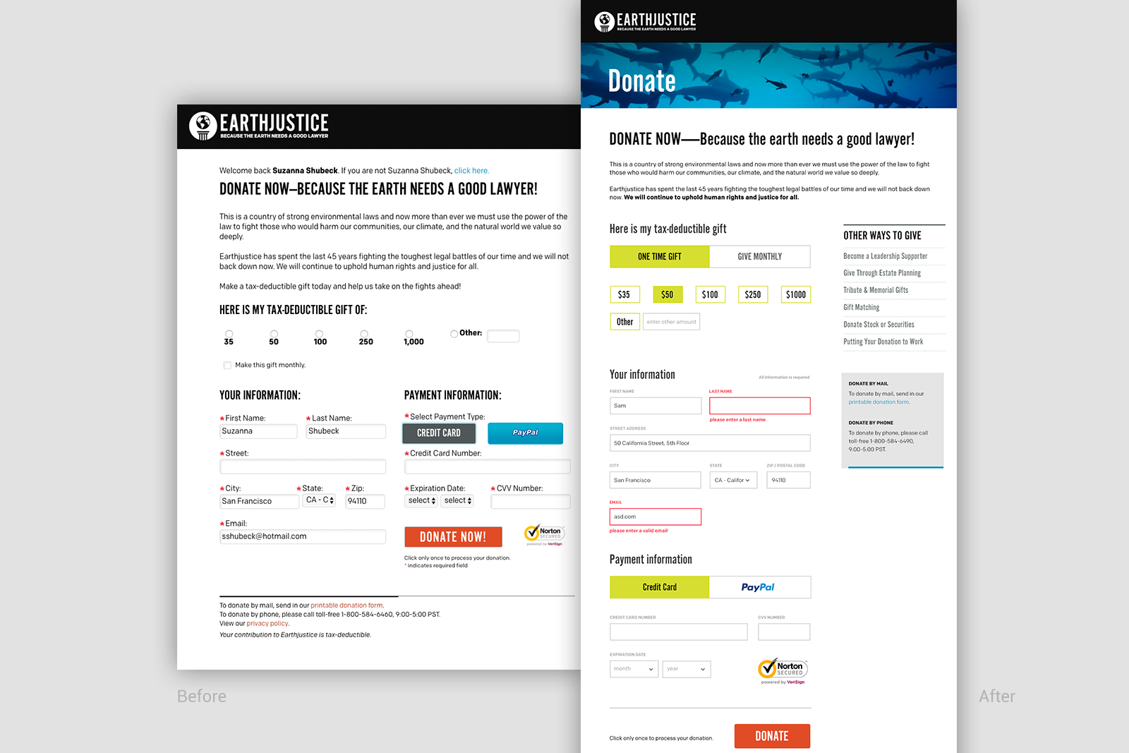
- A redesigned donation form with bigger fields and more white space, improving usability
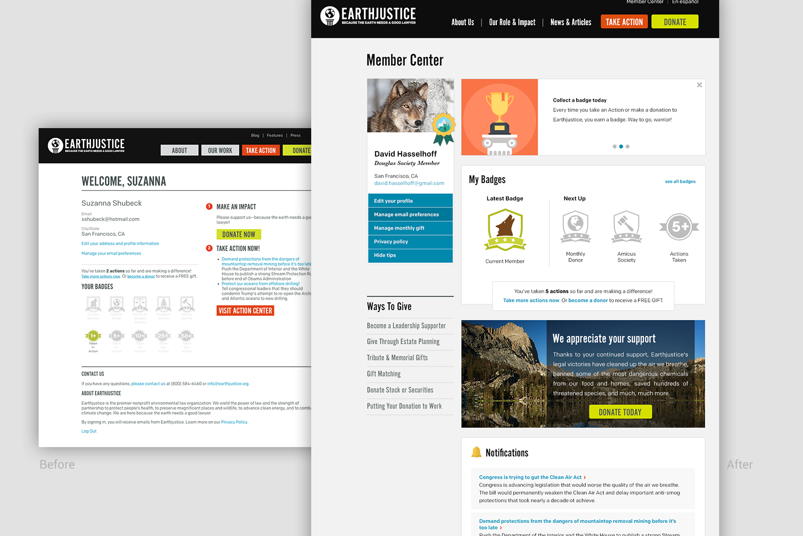
- A Member profile dashboard where donors and activists can manage their email subscriptions, donations, and earn badges for their involvement, building enthusiasm and engagement
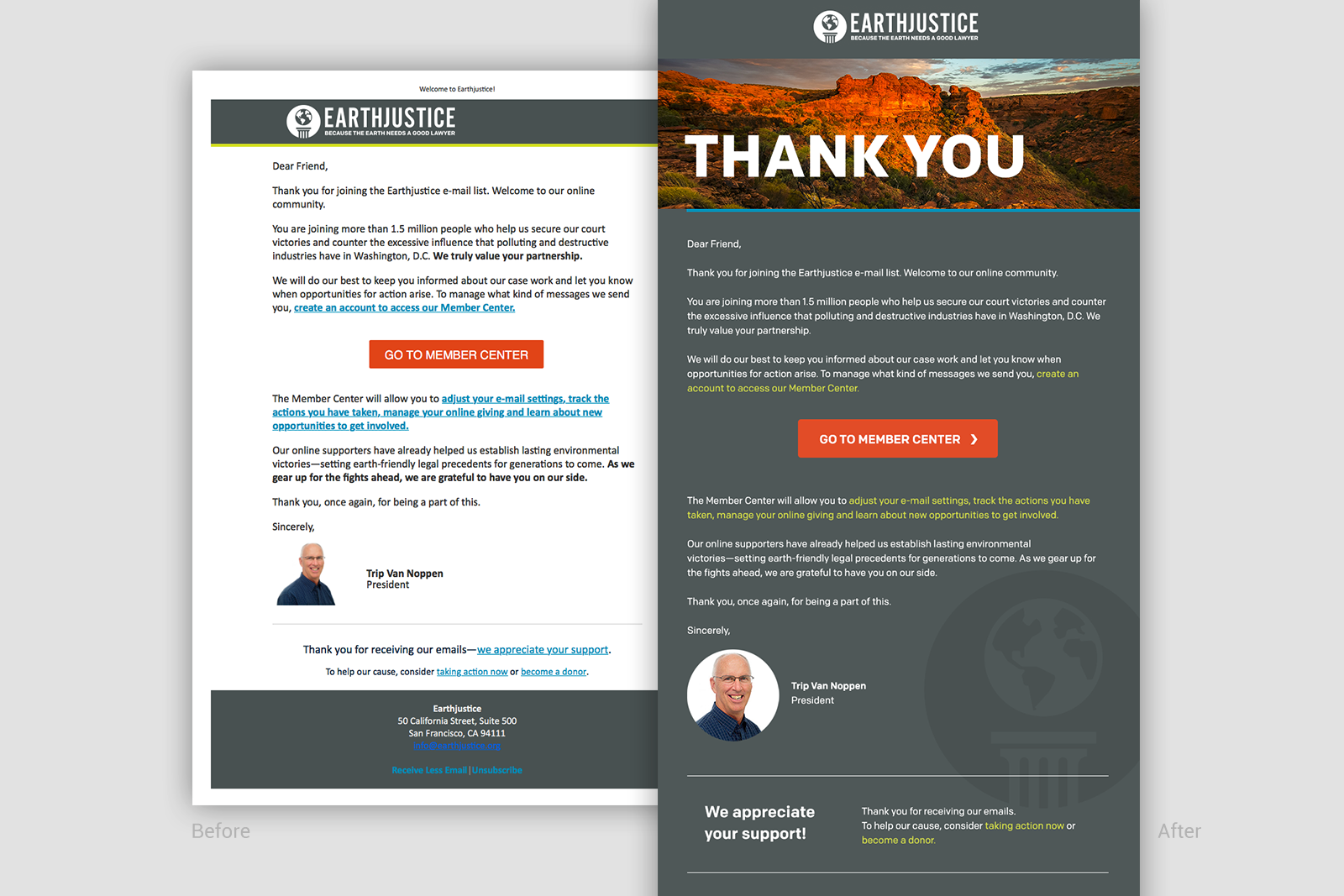
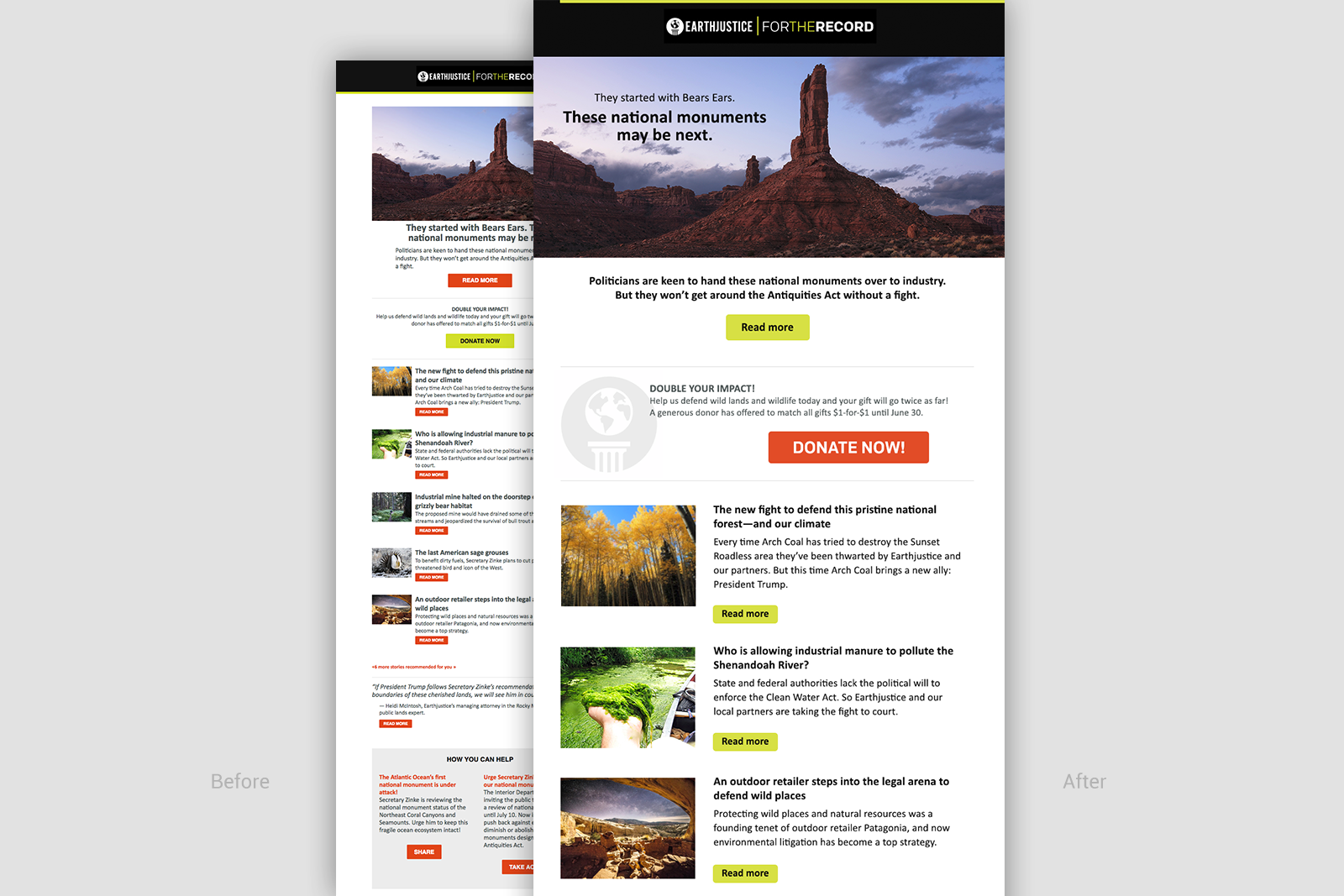
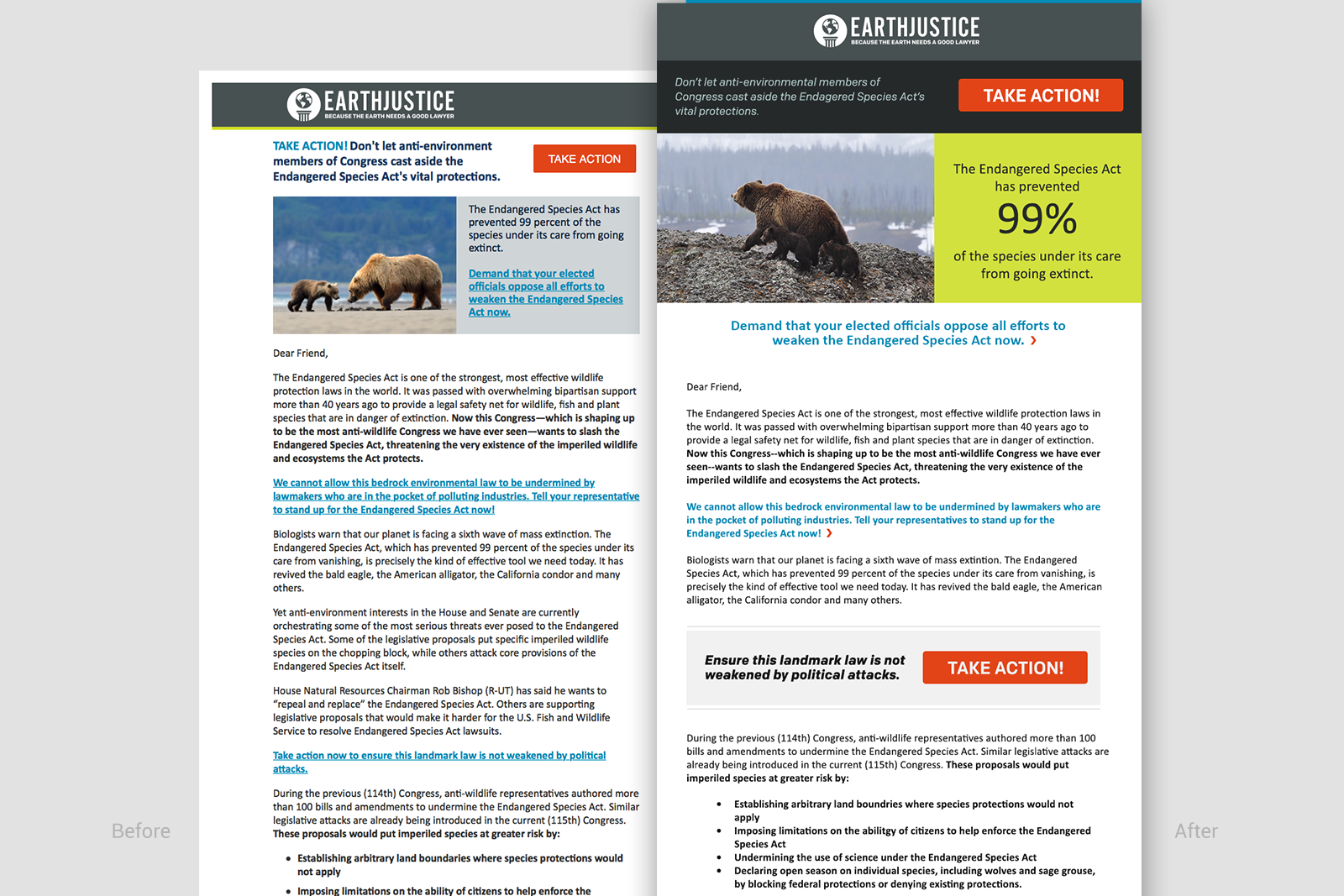
- a redesign of all their email communications; a total of 7 unique emails
